
Apparently the new change has also made the download button work again (there was an issue where, if a game had both play-in-browser and downloadable builds but the former used SharedArrayBufffer it caused Firefox to not be able to download the downloadable builds).
SeaLiteral
194
Posts
2
Topics
19
Followers
22
Following
A member registered Sep 09, 2020 · View creator page →
Creator of
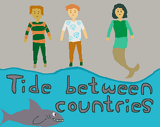
Two people get stuck at the border between their countries, tide flooding it, and sharks around it
Visual Novel
Play in browser

A visual novel about someone trying to escape from a stalker
Visual Novel
Play in browser

A simple platformer with some quirky death animations.
Platformer
Play in browser
A simple platformer with some quirky death animations.
Platformer
Play in browser
A short game about retrieveing discs left behind when moving to a new home
Platformer
Play in browser
Recent community posts
itch.io Community » itch.io » Developer Updates · Replied to leafo in Experimental SharedArrayBuffer Support
I think it looks and sounds really good. I’m just not very good at FPS games, and didn’t have a lot of time to get good at it. And it certainly feels nineties. I haven’t seen a lot of this game (since I only made it past one alien-filled room), and FPS games aren’t my forte, but it does seem pretty good even though I’m not good at it.
If I play it again I might write another comment. Sorry for keeping it this short.
(I’m skipping rating this one since I couldn’t make it very far through it and I’m not sure if it was because the game was hard, because my mouse was too sensitive and you didn’t provide mouse sensitivity settings, or because I’m just bad at games that require mouse movements to be quick and precise at the same time; I’m skipping rating the FPS entries too precisely because I’m sorta bad at them.)
Since I didn’t make it very far, I think I’ll post the UI feedback and perhaps post other feedback later:
First there’s a click-here button. Then there’s the menu with the train with the doors. I tried to click on the “buttons”, then realised I was supposed to click on the doors below them. Apparently the labels were above the buttons instead of being part of them, which confused me a bit but I figured out pretty quickly.
Then I played the game. There was a HUD with symbols I’m not sure exactly what meant. Then I lost.
So I got back to the title screen, clicked on the “click here” button, and nothing happened. Apparently the game shows that button, but the button is just being shown, while the clickable buttons are the main menu buttons below it. Which is a bit of a shame because the UI looks good and fits the game, it’s just not clear at a glance what’s clickable until you actually move the mouse around and see what reacts to the mouse and what doesn’t.
I do think the UI looked pretty good, it was more an issue of the clickable areas not matching up with where it looked to me like they were, but yeah, you might want to see if you can make that click-here button either be clickable when it re-appears or have it not re-appear. And perhaps make the main menu buttons overlap with their labels (and then you probably want the doors to open when you point at their labels, but I’m guessing resizing the buttons would do that automatically, hopefully it’s something you can do without having to do a bunch of image editing).
I liked playing this game, although I didn’t have a ton of irl time, so I just tried to play it twice and when I didn’t make it to the end either time I decided to stop trying.
And based on the thing on the game page saying it locks up in Chrome on MacOS, I think you’re using Godot 4. Yeah, I think Godot 4 was a bit rushed and does a few things like that (and if your game had also been downloadable, Firefox users could have been unable to download it because apparently when a Godot 4 game is playable in a web browser, it does something that breaks the download button).
Fun: It was pretty fun, although getting thrown back to the start a bunch of times got a bit annoying. And I loved having to use the big guy in some places and the small one in others, and having to use them together. It was challening, but I think that made it more fun. I’ll probably play it again after the jam and see if I can get further. Nice game!
UI: The text at the start changes pretty quickly, making it hard to read. The cutscene is nice, but a back button would have been nice too, since the cutscene can’t be replayed or otherwise re-read in the game without restarting it completely. A pause button would be nice.
Sound: I like the chill music even though the game was kinda tough.
Marketing: The logo looks good, but there doesn’t seem to be a logline (I mean, the field that’s called “Short description” when you edit the game page). And just from the logo and title I probably wouldn’t have guessed that it was a puzzle platformer. Good thing it’s an HTML5 game then, because I think that does make people more likely to look at it.
I think I found this one pretty fun even though I didn’t beat the whole game. I had some trouble getting from raft to raft in the level with the Blue Danube music.
Nineties: The low-poly art and limited drawing distance feel pretty nineties. And the gems/crystals being visible from far away where the environment isn’t visible is also something I associate with that period.
Fun: I liked the platforming, and to a lesser extent the number puzzle (the latter could probably do with a bit more polish to make it easier to know whether interactions were detected or not, since I have had times where I might just have been in the wrong side of a blackboard or something, and without feedback I don’t know if I have to redo the interaction for it to count). And I think when collecting gems I was partially relying on the audio to tell me if I had got them or not (I think there might have been some gems you could graze without picking them up, though I guess there are a few that are supposed to require precision to pick them up, so perhaps making their hitboxes larger would cause more trouble than it’d save).
Audio: I really liked the music and sound effects in the platforming levels, but sometimes in the number room when I waked into a blackboard and pressed space I didn’t know if the game did or didn’t detect it. I think the number room would have benefitted from having some sound play when the player interacts with something. I also thought about the lack of music in the number room, but I think having it be more quiet than the levels might make it feel more special (although it might be interesting to see how it would be if walking in that room had a footstep sound, although that might make it seem a bit horror-y).
Graphics: other than the distortion (FOV?) that changes when the camera starts and stops moving (which could be a bit distracting at times, but it’s not really annoying, especially when you get used to it), I like how this game looked. And I liked being able to rotate the camera to better align Corry with the platforms.
At that place where I got stuck in the Blue Danube level, I feel like I would probably have had an easier time if I had been able to view things from above.
UI and controls: The “hub”-style menu feels like a good fit for a 32-bit game, and the score is easy to see too (I can even hear when it increases, well, except in the number room). A visual indicator for “the blackboard recognised that you visited it” would have been nice though.
The controls felt slightly floaty (when I want to stop moving in one direction I have to briefly tap the opposite direction, not like I haven’t got sorta used to that from other games). I also liked the discrete rotation steps on the camera, allowing me to align the character to the platforms before jumping.
Marketing: You went with a logo that doesn’t show the gameplay, but it looks like a mascot, and mascot platformers were definitely a thing in the nineties. It would have been nice if you had a logline (the field that’s called “Short description” when you edit the game page) that gave some hint that it was a platformer, but I’m guessing platformer players would either find it on a list of platformers or they’d guess from the title and logo that they might want to look at the game page. And the game page seems pretty good: retro but not hard to read, and it gives us some story and the controls. Only thing missing is telling us that the jump key also acts as an interact key in some places.
This game was pretty fun, and also fairly easy to understand. And the enemies, projectiles and everything were easy to see while still having a somewhat detailed background. If there’s one thing I didn’t understand at first, it was the one about how to get from each level to the next one after clearing it.
Nineties: Non-scrolling 2D might seem a bit dated, but with rotating sprites, a bit of scaling and the realistic backgrounds that almost seem like what you’d see in a 32-bit PC game. (And at the risk of getting into personal preferences, I think I like that the background doesn’t spin around, because spinning backgrounds can be a bit disorienting at times). The music also has some nice nineties vibes to it. The colours feel like they might be better than what I think of as nineties, but arcade games could look better than console ones, so I think that’s fine.
Fun: I beat this game twice and could have beaten it a third time if I didn’t decide that my time was better spent playing more entries so that I could comment on those too. So I think I can say I liked it (there’s several entries in this jam I didn’t manage to beat before deciding I should continue playing other entries). Well, I guess that could also mean this one was sorta easy (especially when you realise you can move backwards). I think the audio might be helping the game be fun, and I think that’s nice.
Sound: So I listened to the title screen. It was nice. It fit the setting and the nineties theme. I also noticed that it didn’t loop (not that it should necessarily start over when it ended, I think it should do something else, but more about that in the UI section). And it might have been a bit slow if you intended for it to sound arcade-y.
I like the in-game music and the sound effects too.
Graphics: fairly good. I can see all the things I need to, and they look pretty too. The colour palette also makes everything fit nicely together and makes it look spacey.
Fun: The game was pretty fun to play. I already beat it yesterday and yet it was still fun to play it again today when listening to the audio.
UI: I like the arcade reference with “Free Play” and “Insert Quarter. Not that you went all the way on the arcade visual style though (in an arcade game, I would have expected to see the game “play itself” in attract mode, to show what the gameplay is like).
The instructions fading out seems a bit unnecessary: it could just have stayed on screen until the player left the level. But they do stay on screen for plenty of time, although as they fade out they slowly get harder to read.
Marketing: The game is simple enough that it doesn’t need a long description, but I think it wouldn’t have hurt to mention the controls there. The game itself does show the controls at the start, but if you want to re-read them later, the only way to do so is to reload the page and start over.
Also, while you have tags for things like the genre, I think there’s some setting you could use so that the link to the source code can appear in the “More information” section.
The logo that I see on the list of submissions seems to hint well at the artstyle and setting, and with the logline “Top-down shooter written in JavaScript” I had a clue roughly what to expect, and it did meet my expectations and was fun to play. And it even hinted at the fact that it was playable in-browser, which if I weren’t trying to play all entries would probably have made this one of the games I played anyway.
I found all 27 samples, and the coziness of this game was a nice break from playing horror games (which there seem to be three of in this jam).
Nineties: The game looks like it could probably run on a 32-bit console.
Fun: Pretty. I’m not sure if I’d have liked playing this game for several hours if there were a lot more samples, but 50ish samples would probably be fine. I guess more items could also help make it worth collecting more. And yeah, the things you mention having planned might help too.
Sound: The music seems a bit mysterious but relaxing, and goes well with the game, which is about exploring and doesn’t seem to be about danger. And the sound effects also made it easy to know whether the samples did or didn’t get collected (though sometimes it would collect ground samples when I tried to collect a sprite that was on the ground, I guess I have to be fairly close to the sprite but perhaps it would have felt better if it looked at the distance to the tile under the sprite instead of the distance to the sprite, or whichever of those two were lowest).
Graphics: pretty good, and you don’t really notice the things that might not be as intended (well, I did notice a dotted line between two tiles, which I think was some weird rounding error or something, but it wasn’t very noticeable, and I’ve seen more obvious rendering errors in old 3D games).
UI: There’s plenty of options. Even keybindings, which I used to remap movement to the arrow keys. I also like that I can choose whether I do or don’t want to run the game in fullscreen.
But I initially misunderstood the codex UI, so where it said X/27 I thought it meant I had to collect 27 samples of each type. So that confused me for a little while. Perhaps having the word “sample” before the X/27 would hint that I don’t need to find several samples of each type (other than to be able to get the items).
Marketing: You have a nice collection of screenshots and I like the logo too. And the logline (“Cozy retro 3D collection adventure”) seems descriptive enough, although the word “adventure” made me expect some story.
As for the game page, the green text feels a bit dark on the black background, but other than that it seems like it tells me what I want to know. It doesn’t tell me the controls but the game itself can show them and even remap them, so I don’t really need to look for those on the page.
The web build seemed to work, albeit without audio. The downloadable build was a ZIP file which contained some files, one of which was itself a ZIP file containing some of the same files plus another file. Am I guessing correctly that you threw some files into a folder, selected them, right-clicked on them, and made them a ZIP file? Well, I think letting the engine generate a ZIP file and just using that would have been less error prone. Turns out I have to use the EXE file from the outer ZIP file and the PCK file from the inner ZIP file. You might want to mention that on the game page until you can upload a fixed build.
The framerate in the second level felt a bit low, but playing in a smaller window seems to fix it.
Nineties: The output resolution looks kinda high, which doesn’t fit the nineties theme very well (and while having a low framerate might be something you’d get in some 32-bit console games, the fact that I could fix it by making the window smaller makes me think it probably wasn’t intentional). The blur on the walls might fit an N64 game, while the blur on the background I’m less sure about. The lighting does look 32-bit, or perhaps a tad simple for that (I think since the environment is static, it could have had slightly more detailed lighting, see the graphics section below).
Fun: I liked the first level more than the second because the latter feels a bit too zoomed-in, meaning you can get into dead ends in the first couple of tries until you know where you’re supposed to go and then it’s suddenly easy. I did have fun beating both levels.
Sound: Nice 32-bit-ish music and I like the engine making a sound too. Though I guess it could have been nice if there was a sound that played when you hit a wall and respawned.
Graphics: The game looks fairly good, although the details feel like they were split unevenly. The ship looks quite bit more detailed than the walls, which would probably make sense since players are going to be moving the ship and wanting it to look good, but I found that when playing the game, I actually look a lot at the walls, both to figure out which way to go and to avoid crashing into them. And if you were playing this game in a resolution of 512p or less, the small details on the ship would probably be hard to see. And I think cutting new edges near the existing edges and then darkening the original edges with vertex colours could work as a simple type of ambient occlusion (probably using brown rather than black since the light that bounces forth and back between walls would take the colour of the walls multiplied by itself, thus making darker parts more saturated).
UI: There isn’t a lot of UI in this game, but it doesn’t really need it either. But I think the launch pad and landing pad could have had different colours or some other way to tell them apart, especially in the second level where it’s possible to get lost.
Marketing: The logo looks pretty good and polished. The logline (“Fly your ship from Launch Pad to Landing Pad.”) tells me what the game is about, and the game page seems pretty good too. I even noticed that the game page has completely different colours for text and hyperlinks but both are fairly easy to read on the background. Good job!
Pretty well made in terms of visuals, audio and gameplay, and nice that you thought of more players than just Windows users.
Nineties: I guess being this zoomed-in was a way to avoid having to draw much on screen per frame, but I’d probably have preferred seeing a bit more space around the ship. The graphics seem low-poly enough that being able to see a bit further away from the ship.
Fun: It was fun to play for a while, but doing the same thing over and over did get repetitive after a while. Also, it seems you can survive for quite a while, so being able to save the game and continue later would be nice, or at least being able to pause the game if you want to walk away from the computer for a short while.
Also, at some point I got a mission that told me to go to the place where I already was, so that was a quick mission to do. Also, the game seemed a bit zoomed-in: it’s hard to dodge an obstacle you can’t see coming until it suddenly hits you from behind.
Sound: the music fits both the nineties and the game style and setting. And the sound effects make it pretty obvious when you hit (or get hit by) asteroids. If you want to add more sounds, I think sounds for getting cargo and creds might be a nice addition, but not really necessary.
UI: The arrow was useful (although I think games in the nineties tended to avoid such arrows due to a patent which I think has since expired; I think that situation led to some games using minimaps instead) and I can read the mission descriptions when I get missions. I also saw that when I clicked the button after getting a mission, trying to “end the cutscene”, I got “we don’t need that here”.
Marketing: The logo looks nice although I would personally have preferred it to have a slightly bigger font (but with the white text on the pretty dark background, it’s still fairly readable). The logline (“You’re needed in space. Do your part for the system.”) seems fine, it doesn’t say which type of task the player is needed for in space, but with the thumbnail showing one ship flying away from something and a couple of asteroids, I could mostly figure out (however, it’s not obvious what the ship and the station is doing, it’s not even obvious that the station is a stationary thing and not a UFO that’s moving around.
The game page seems fairly complete (and also, it says that it’s about hauling cargo). Only thing I found a bit harder to see were the hyperlinks, especially those in the “More information” section, perhaps they could be darker or bolder.
I think at least the X86_64 one needed some configuration to run. I’ve seen this enough times in other jam games that I could fix it faster than the game could start, but here’s what I did after extracting the ZIP file to an empty folder: I right-clicked the extracted executable, clicked “properties”, selected the “rights” tab, and checked the checkbox whose label says “allow this file to run as a program”. Usually it’s checked by default, but sometimes (especially if you extract and recompress the ZIP file) it might be unchecked.
What I’m guessing might have happened is that Godot created a ZIP file with a file inside it that had a “this file is executable” attribute attached (which ZIP files can store, but it can’t be extracted on Windows), and then you extracted and re-encoded the ZIP file on Windows, so the attribute got lost in that process.
Windows also has some Windows-specific attributes like “this file should be read-only” and “this file was downloaded from this URL” which I think ZIP files can also keep track of, also with the issue that if you were to extract them on Linux it wouldn’t know what to do with them and they’d probably get lost. So I guess the conclusion of this comment is that ZIP files don’t hold exactly the same information on all OSes.
(As for what I thought about the gameplay, graphics, audio and game page, I think that isn’t Linux-specific, so I’ll put that in a separate comment.)
I think that error doesn’t necessarily mean the card doesn’t support the OpenGL version. I think players might be able to update their drivers and get it working (yeah, Windows doesn’t install up-to-date OpenGL-compatible graphics drivers by default; I don’t even remember how to update them). Other than that, I think games can override the default OpenGL implementation with a userspace one such as Mesa or ANGLE (the former is more general-purpose, the latter might be more efficient but is specifically for OpenGL ES). But I haven’t tried that myself.
In fact, I’ve run the Windows build on Linux (using Wine) which seems to work fine. Although I might want to play it again just to remind myself of some things before I finish typing feedback for this game.
A cute story about friendship and a li’l ghost. And it has some fun point-and-click (and drag-and-drop) gameplay.
I downloaded it, but since the Windows build didn’t seem to run on Linux (sometimes Windows builds of Unity games do run on Linux, and sometimes they don’t, and sometimes they do but 2D graphics get weird, this one kept trying to start without starting), I had to play it in-browser instead.
Story
It seemed kinda spooky, especially until the ghost appeared. And I liked that the player character didn’t say anything other than through choices and point-and-click.
I think the humour was good, and you did well with the character personalities too.
And I like reading about friendship. Cute ghost stories about friendship are usually fun to read.
Audio
I think one of the things that got me to play this entry was seeing it mentioned as having the best voice actor in the jam. And yeah, the voice acting worked really well in this entry. It really showed the personalities of the characters and the relationship between them.
The music was nice too, although I found myself turning down the SFX volume to more properly listen to the music, and some tracks felt a bit short (e.g. there was one where it seems like it’s slowing down, and instead of changing into something slower paced for at least a couple of bars it just jumps back to the start, feeling like the piece was meant to be longer but that you ran out of time and left it shorter). You did manage to keep the music both spooky and cute.
The sounds that the ghost made were nice (also kinda needed), while the thunder was loud enough that I turned it down. I almost feel like it could make sense to have separate volume sliders for them.
Art
Both cute, painterly and spooky. The li’l ghost is adorable, and made some nice drawings too. The expressions are so expressive… I mean they complement the text and voice acting really well, and they give off a cartoon vibe that’s really cute. And I loved the animations too: the little ghost (was that his name?) didn’t need a voice actor with those animations, right? (I’m sorta guessing Li’l Ghost nods when I ask this question.)
UI and Accessibility
The UI looks good, and I like the point-and-click mechanics. But I also think the accessibility features could be better, especially the following:
- While the point-and-click mechanics probably make these harder to implement, it would be nice if there was rollback and/or history. Even just a short-term history (being able to re-read the last five lines of dialogue or so) would help if a player accidentally ends a line of dialogue before reading the whole line. (I didn’t have much trouble, since I was waiting for each voice line to finish before advancing the text… and I avoided enabling auto forward because I felt like that would force me to keep reading at a pace dictated by the game while not being able to re-read text if I missed something; if there was a way to re-read a few lines back in time I probably would have enabled auto-forward on my first playthrough.) Also, on later playthroughs where I was trying to get through some parts quickly, getting too far and having to start over was kinda annoying.
- I was able to read the moving text (when the individual characters in a word are moving up and down or shaking) but an option to disable those effects might be useful for people who don’t see as well as I do. But at least you don’t seem to have those effects in those bits of text (choices and location names) that aren’t voiced. Seeing as you mention in a devlog that you plan on releasing the text in more languages but leave the audio in English, I think an option to keep the text steady (and perhaps even options to change the font or font size) would be nice.
Marketing
The capsule image (thumbnail, but why not use a fancy word for it?) shows the artstyle, hints at the type of story, and the font makes me think it’ll probably be a fun story. It is.
The ~~logoline~~ logline, seems interesting and spooky. And it says “little ghost”, not just ghost, so I guess it also hints at the cuteness without mentioning it directly.
The game page is pretty but readable. – Actually, it’s pretty and readable. Or at least I wouldn’t consider it “pretty” if the text was hard to read. – Anyway, it gives me the impression that this is a cute ghost story.
Other
The drag-and-drop minigame took me a little while to get through because I kept clicking on things without getting them to move until I realised I had to hold the mouse button while dragging them.
What I liked most? Probably a lot of stuff, but if I had to pick just one thing I might pick the voice acting because that’s something this entry did really well and many entries didn’t even bother having VA. (And just because the Writing and Art sections above are a bit short doesn’t mean I didn’t enjoy the writing and art. I might just be better at putting into words what I think about audio and UI.)
And what I liked least? Probably the lack of rollback/history making it tricky to re-read stuff I missed.
The Spooky Ball, you say? I guess that makes this one of the “ballsy” entries (along with Ball of the Black Cat and Undo the Mustache Curse, Witch!).
I played this a while ago and was pretty sure I’d taken notes. Well, I guess I’ll play it again then. It was fun enough the other times that I think it won’t be boring to play it again. But sorry if I end up making this comment a bit short to save time writing it.
Story
I can name the ghost anything? Well, almost anything. Let’s go with “Happiness” (and hope that ghost isn’t Scottish, because “looks like a Happiness to me” in Scottish English would look like a grammar mistake to me). (Also, it’s nice that if I leave the name blank it doesn’t break anything.)
And nice comedy. A bit mean to say I might have become worthless, but I guess I prefer called worthless over being called expensive.
Audio
The music sounds spooky, fun and cute. And a ghost could probably dance to it. Well, I don’t know how you dance without arms or legs, but ghosts might know.
Art
Cute, fun-looking. Cartoonish. You made everything except the background? Which of the two backgrounds do you mean?
The simple animations are simple. Wait, the simple animations are cute. That’s what they are.
My only nitpick on the art is that some of the letters in the game’s title on the main menu are a bit hard to read on the background.
UI and accessibility
Ren’Py default UI? I guess I don’t have to worry about whether the text is readable on the background then. I have more entries to play, so I guess I’m not spending half an hour on testing a short entry like this.
The default UI might be a bit generic, but that’s still better than something that hurts readability. You did a good job with that default UI.
Side note: I had trouble typing the word “default”. For some reason my fingers wanted to type “deaf” instead of “def”. I wonder why.
Other
I think what I liked most was probably the dialogue and cute art. And what I’d suggest changing could be… avoiding the word “a” and using “some” instead because “a Ooh” sounds a bit odd, and while “an Ooh” might sound better I don’t know if you can find a rule that gets it right all the time. (I mean, humans can, but computers aren’t very good at this).
Quite different from the other entries I’ve played, but beautiful in its own way. (Also, I wrote some of this some time ago and got interrupted, I didn’t check sentence by sentence if everything I had written was still true about the current version of the game. Also, I’m making this feedback a bit shorter than I could want to, to save time writing it, sorry about that.)
Story
Somewhat sad, but not really scary. And the friendship between the characters was nice (I like when characters care about each other for other reasons than romance). And a nice change of pace both from the horror entries and the comedy ones.
And I’m not sure how to pronounce the MC’s name, but I’m sorta guessing it ends in something that sounds like “life” or “leaf”, and the first part sounds related to break, so that seems to make sense.
Audio
The music is beautiful (I particularly like the part that plays when the characters are in the forest) and goes well with the art. The different themes seem consistent with each other and they also seem to fit the moods of the MC.
Art
I like how some of the art, especially plants, is in colour and some of it (buildings and inserts/CGs) is in black and white. The art also looks like it was made with love, which I think goes well with the theme of the game.
UI and accessibility
The UI using black and white fits the artstyle and the sad mood. And you have the usual accessibility features of Ren’Py. But if I may nitpick, I think the quick menu buttons are hard to read in front of the forest background. But yeah, quick menu readability issues seem to be kinda common in Ren’Py VNs.
Marketing
The game page seems to answer all the questions I would have about the game, including the wordcount. I also see several screenshots on it.
And the logo fits both the mood of the story and the artstyle of the game. And the text in it is easy to read.
Other
What I liked most: the atmosphere that permeates the writing, music and art all at once.
What I’d suggest changing: perhaps you could make the quick menu easier to see in the forest scene.
Thanks! I think the minigame was pretty much “how can I make a music-related minigame that I can more or less quickly figure out how to make in Ren’Py”.
If I’d been making it in Godot I would probably have added a keyboard shortcut to each string on the harp, but I didn’t have time to figure out how to do that in Ren’Py. (I avoided using Godot to avoid possible concerns about whether or not I could use tools I had made before the jam, and whether people could think I had used them even if I hadn’t).
And I’m glad you liked the writing. That was the thing I put most effort into, so it’s nice to see that that effort actually made the game better.
There’s an anime genre called battle action fantasy. Well, it’s also a VN genre, and I think this VN fits into it.
Story
I like the story, both the mystery part (even if the mystery gets solved by the characters without the player having to solve it themself), the comedy (which I sort of expected to be there, because I could tell from the game’s logo that there was probably going to be some), the battles (actually, I probably only care about battles because they create emotions).
Also, whenever I’m playing a VN, it takes me some time to get to know the characters and setting well enough to figure out which choices make most sense to the character. So the hardest choices to make are actually the gender and name
Like some of the other people here, I think I can say that Priscella seems to be the most developed character: the one that seems to speak most, and the one that others seem to speak most to and about. And on top of that she’s the one that tells the MC to “ask someone here” out, so I guess I’m supposed to ask her at least on the first playthrough, unless I ask someone else out of spite because the MC is tired of all this cult stuff or something like that. I do think you did a decent job at letting the player and MC form opinions about the LIs before the choice, although the arguments in favour of choosing Victoriette seem a bit forced (if you’re RPing and don’t allow yourself to consider the dialogue that the MC hasn’t heard when making the choice, you only have a single line of narration to go by, and the fact that Victoriette seems to have cat ears). And Mask also seemed a bit hard to trust.
Audio
I like the music, and it seems the different pieces of music fit together although I notice that you did use some silence to make the transition less abrupt.
I also liked the sound effects. And I don’t speak Japanese so I didn’t understand the songs with lyrics.
Art
With two variants of the MC (plus the non-human one), six LIs, another character, several locations with different backgrounds, and I didn’t count how many CGs, I think you must have done plenty of work to make this. And despite that large quantity of art, the quality is good too.
I also like the animation. The characters even seem to move their mouths when speaking (which also makes it easy to see which sprite goes with which name). And they blink their eyes… in sync. Now if the blinks were slow that would be how cats show that they love each other. But yeah, all the characters blinking at the same time seems oddly “proper” whereas random blinks like what I think some other games use would seem kinda messy. But I do wonder if it could have been possible to synchronise the animations to the BGM so that everything that moved did so to the beat of the music.
UI and accessibility
You have the same really minor bug that I also have: text that isn’t dialogue not appearing in the history screen. Except in your case you barely give me enough time to read it before auto-advancing. Text like “several days later”
About the line “when I have my cult to form” I think I’d probably have put the word I in a different colour in addition to or instead of italicising it (apparently some people who make subtitles for TV shows use colour instead of italics when emphasising specifically that English word).
I see that most names are written in white text with black borders but the MC’s isn’t. Which wouldn’t be an issue if it weren’t for that line “What kind of spell was that, you useless witch!!” where it overlaps with a partially white background.
And I don’t know why it took me a while to figure out how to continue from the “hold up” screen. I think I pressed the up arrow and held it down and I didn’t realise I also had to press enter. Perhaps if the button looked more like a button (had a border around it) it would be easier to figure out what to do with it.
Also, the text on the game page could have been easier to read (although zooming in helps). The text in the images seems fine to read with the eyes, although I’m not sure a screenreader would read it.
Marketing
The game page looks pretty good, and even has portraits and descriptions of the main characters. And enough screenshots to give me an idea what type of game it is.
Other
There’s a part where the quick menu stops being shown. I’m guessing that’s a bug. And I don’t actually remember where exactly it disappeared and where exactly it reappeared.
What I liked most: the story and cinematography.
What I’d suggest changing: Fix that thing where the quick menu disappears for a while?
I’ve read real-world terms of conditions and found them entertaining even though they seemed kinda hard to read, like a bowl of spaghetti code with bugs eating it (whether they’re eating the bowl or the contents is something lawyers could argue about for hours on end). But these made-up ones are both fun and terrifying, which is nice for a comedy/horror VN. (Also, sorry if the review is a bit short; I’m trying to review as many entries as possible before the rating period ends and also before the end of the month, as long as I don’t overwork myself.)
Story
Amusing and deep. Amusing because of the clauses that start out a bit weird and then go weirder and you end up reading weird sci-fi horror that still sounds so crazy that it’s more comedy than horror. Deep because it leaves me wondering which weird things I’ve agreed to over the years (probably nothing as crazy as this, hopefully).
Audio
The main menu music sounds fun and corporate. You can guess not only that there’s going to be comedy but also what it’s going to make fun of. And of course I had to let it end on a specific note when exiting the game.
The music that plays while you’re actually reading the T&C is also nice and corporate.
Art
Creepy-cute like corporations like it. I’m sure you’ll become successful if you pursue a career as a graphic designer or illustrator or whatever corporations call their artists nowadays.
Marketing
Between the text contrasting well with the background and the drawing of the soulless character falling between the papers, I think the logo is really good and fits the tone of the game. And at first I thought “why use a serif font in a logo that tries to look modern?” then I realised lawyers often use serif fonts in their logos so it actually fits the game.
The logline seems to describe what the game is about, although I would have preferred if it was more obvious that it was comedy (perhaps add a word like “crazy” or something like that).
The game page is a bit simple, but that’s what corporations seem to roll with nowadays unless they do that annoying paged scrolling thing (I dare them to make a page-scrolliing UI for displaying their license agreements, complete with illustrations next to every clause). I like that the tags are horror, satire and short.
Other
What I liked most: How corporate everything feels, and the text seeming crazy, then you read further and it gets crazier yet.
What I’d suggest changing: Perhaps you could add those parts you haven’t added yet. Unless you’re making fun of corporations that leave partially written content on their websites or something.
In addition to what others and I have already mentioned, it seems jam rating pages don’t show download buttons for entries whose web builds use this. Or is it some other thing at play? I don’t fully understand when those buttons do and don’t show up.
I also wonder if the issue aXu mentioned affects all games that have both downloadable and HTML5 builds with the latter requiring SharedArrayBuffer, or if it only affects those that are set to “No payments”. If the latter, I suspect it might be fixable by simply having the download button open a new tab with the actual download button, but I haven’t really taken the time to experiment with this (I should probably try to see if download pages on devlogs work).
Legrange's Halloween Adventure jam comments · Replied to bankerz in Legrange's Halloween Adventure jam comments
I tried downloading them several times, several hours apart, and I was able to download two other entries from this jam in the meantime. So I think it does seem to be something that affects this entry and not all of itch.io. It seems I get a connection error, but only on this game. Perhaps I could try installing the itch.io app and seeing if I can download it with that, or I could try using another browser (I usually use Firefox)… I did manage to download another Godot-based entry (Summoned) several days ago.
Actually, I think I managed to solve the mystery: It’s because of a weird issue between itch.io and Godot 4 (and apparently it happens in Firefox but not in Chrome). When you enable SharedArrayBuffer support, it changes some things so that the game can run properly in web browsers, but apparently that can break the download button. I don’t know for certain what Summoned might have done differently to get around that issue (it could be that because it’s enabled donations its download button isn’t on the same page as the web build… I guess the closest you might be able to do without enabling donations would be to add a devlog where you leave the game files attached… I might test that on another game tomorrow).
Undo the Mustache Curse, Witch! jam comments · Posted in Undo the Mustache Curse, Witch! jam comments
I like the comedy in this one. And I played it several times and now I realised I’m getting close to the end of the rating period so I should finish writing this comment even though I could probably keep playing this game some more time. (Also, sorry that I use UK spelling in this comment. I moust be consistent, y’know.)
Story and theme
The story is pretty fun, and I think you did a good job with the comedy. And making “dumb” choices is at least as rewarding as making “sane” ones, which is nice.
The extras section was fun too, especially the bit about Nivienne’s wand. And I like the decisions you took while writing the script, especially the one about keeping all the characters alive.
Audio
The music seems to both fit the mood and oddly enough also the environments (I could totally see the characters dancing to that music, couldn’t you?
Art
Pretty good, and in an artstyle that goes well with comedy without looking low-effort. I also like the expressions and how you moved the sprites around. And then when they go from the forest into the bar and it just changes the background while keeping ~~Eldie’s~~ Princess Elderflower’s sprite in the same place as if she teleported there, which she probably didn’t (otherwise she could just have teleported there earlier, right?) but it felt like I was probably supposed to think of that possibility even though I was supposed to quickly figure out that that wasn’t what had happened.
And I agree with the text on the game page about the characters being cute. That’s also how I imagine Knight Cierre: clumsy but cute.
UI and accessibility
Nice UI! The moustache fits it really well. And I think a moustache might be something that’s sometimes used in comedy-related logos, but here it’s also an element in the story, which makes it work better than if it were just a symbol of comedy.
Marketing
The page seems pretty complete, with logo, summary, features, screenshots and credits. The capsule GIF shows the two most important characters (sorry Cierre and Princess Rosetta, I think Princess Elderflower and Nivienne are the main characters in this story… and I’m guessing you’re okay with me thinking so).
I really like the logline, especially with the word mustachioed. It’s clear what it means, it’s clear what genre it’s going to be, and the game is actually as good as you made it seem.
Other
What I liked most: The comedy and art.
What I’d suggest changing: I’m not sure. Perhaps you could ask the characters if they have any suggestions? But I have to write something here, right? Okay, I guess I’d suggest making that ending where everyone gets moustachioed.
[Edit: At first I thought the moustache on the UI looked different from the one on Princess Elderflower, but I think it’s the same one just under slightly different lighting.]
I know how I want to end this comment… 🧔 No, that’s not how I want it to look. It looks way too serious, and also a bit too masculine. I guess there isn’t a character I can put here. Unless there’s some alphabet that has a character that looks like a moustache. Oh, I guess I’ll just go with {
Cats, comedy and a cute story. And you got saveslots working in a Godot game. But yeah, I had to play it in browser only since the download buttons doesn’t seem to work, or at least they weren’t working when I tried to use them. And sorry if I’m making this review a bit short and perhaps focus slightly more on some things than others, but I’m trying to play an entry from this jam per day this month, so I can’t really spend a whole week on writing each review.
Writing
The story was pretty fun and wholesome. A bit torn by some endings crashing the game (I think this happened when visiting each location twice, but I think it also happened with at least one other ending; I do remember that the ending you get from visiting the farm three times seemed to work and have audio) but I liked it anyway. A cat making friends is so cute. The characters were pretty fun to talk to. And a familiar cat gathering stuff for a witch for a Halloween party seems like it fits well into this jam.
Audio
The music sounds fun, and definitely fits a comedy game. And the different pieces of music seem to have enough in common that they feel like they’re part of the same game while also setting reasonably different moods for the familiar and “unfamiliar” locations. It does feel like the latter sounds louder than the former. I think the obvious way to fix that would be if you can loudness-normalise it to -20 LUFs or something like that (alternatively, you could just play them at different volumes in Godot; you mostly want the two main tracks to sound about equally loud, and you probably want to listen to the part with the percussion since that part is probably going to feel louder than the part without it; if you go this route, consider testing with both speakers and headphones, because the drums might sound louder in speakers).
Art
Simple, perhaps a little childish, but I like it, especially in a comedy VN. And I would say having more characters and places at the cost of a simpler artstyle isn’t really a bad thing. And you have portraits (or whatever you call those images of speaking characters that show up in the textbox), which is another thing I like seeing.
UI and accessibility
The text is a bit blurry, and while I can advance the dialogue with either the mouse or the keyboard it doesn’t seem I can select choices using the mouse. But I like that there’s saveslots. I don’t usually see that in Godot VNs, but I want to see more of it.
The text buttons with white text on a grey background might look a bit dull in such a colourful game, but they oddly fit the simple artstyle.
Marketing
The game page seems to answer all the questions I would have about the game, although the length is mentioned in hours rather than words (reading speeds can vary quite a bit). I also don’t see the screenshots on it (if you click “Edit page”, one of the things you can change is where screenshots appear).
The logo seems to look good although the text is a bit hard to read. And the logline seems to describe the game fairly well (especially if you see an orange cat as a playful cat, which I know some humans seem to do).
Other
I see an “exit game” option in the main menu in the web build. I haven’t tried clicking it, but I know those don’t always work (in fact, on Itch, they usually don’t).
What I liked most: the dialogue and the save menu.
What I’d suggest changing: fix any endings that crash the game. And probably figure out why downloading doesn’t work.
[Edit: I’d forgotten to add the marketing section, so I’ve added it now]
Thanks! The harp minigame was my attempt at learning to use imagemaps in Ren’Py and using them for something. And the poetry was my attempt at doing what I seemed to be good at (because I’ve noticed that when I write poetry in my VNs that seems to be what people like the most from them, so obviously I had to include some poetry in this one too). And then I plan to translate the whole thing into Danish and Spanish (I already translated some of it, but I haven’t released the game in those languages, that’ll probably be some time in November or later).
As a translator, I like writing stuff that isn’t easy to translate, and then trying to translate it anyway. So that means things like poetry and comedy. And yeah, I had seen enough poems and VNs about love that I wanted to write a VN with poetry about something else.
I tend to play plenty of jam entries in-browser, so it seemed like a good idea to try and make my own entry browser playable too. I think it might even be possible to play it in a browser on a phone, although I haven’t tested that, so I haven’t marked the game as mobile-friendly.
Thanks! I think poetry was what I spent most time on, both writing it in English and translating parts of it into Danish and Spanish. I haven’t even released the game in those languages but I’ve translated most of the poetry into them so that I knew it would be reasonably doable (it wouldn’t be fun to release a VN in English and then be unable to release it in the other languages just because I’d written something I couldn’t translate).
Playing it today, picking “wind” at the first gate and “might of mass” at the second, then picking the leftmost option for the third choice, I got an error. And apparently copy-pasting the error didn’t work, so I typed it by hand: IOError: Couldn't find file 'Demons/Paimon.png'. I thought I’d mention it. (Also, I’m pretty sure I only posted my other comment once, so I’m not sure why it showed several times; I’ve removed the duplicates now.)
The cat is cute (and mysterious too!). Waiting five minutes while barely anything happens seems like a lot to wait more than once though (especially if my goal were to get each ending multiple times…. well, at least I can type some thoughts about the game while I’m waiting). The main menu using the colours of the cat and a cute font is nice too. And I think the use of speech bubbles fits the cute style of the game.
The sound captions are nice to see (more games should do that) although the one for the main menu music is a bit hard to read in the short amount of time that it stays on screen.
It was fun to play this one, even if I’m keeping this review a bit short to save time.
This one was pretty fun, and it was short so it didn’t take me long to get both endings.
Story and theme: It’s fun and cute. And it involves a somewhat scary situation involving a witch (even if it stops being scary later). I noticed few typos (I can make a list of them if you want).
Rose is clumsy and cute, and I guess her clumsiness is a part of what makes her cute. That and her explanation of why she likes the MC so much (so many VNs seem to have characters fall in love for no reason or because of looks, this one seems to have a reason I can understand a bit more easily).
Audio: The main menu music is cute, just like the story. And it’s fun to listen to while typing this feedback. The music in the beginning of the story sounds mysterious like the situation the MC seems to be in. And the other piece of music once it gets less scary is also fun and cute like the main menu music. The different pieces of music also seem to fit well together.
I do notice that when the VN ends I felt like sometimes it takes a while for its background music to finish whereas the main menu music seems to start immediately. I’m not sure what to think of that. But it doesn’t happen every time.
And I think you did a good job with the sound effects. Sound effects are obviously more noticeable when you take away the visuals (i.e. the parts where the background is black) but they’re nice in all the places you used them.
Art: I like the cute cartoonish art and the composition. And even though it’s cartoonish Rose still has five fingers on each hand. The light-and-reddish witch on the darker background. And Rose’s pose and expression changes. And you actually drew another background just for one of the endings, that’s nice.
And also your use of black screens. And I also like the main menu with the logo, portrait, stars, sparkles and soap bubbles.
UI and accessibility: The UI with the roses fits the name of the witch. And the font is cute while still readable. But the border around the textbox being almost the same colour as the quick menu font makes it a bit hard to read the buttons since they overlap with it. The save screen with the roses on the hover image of empty saveslots is nice too (although the roses in the UI seem a bit more of a romance thing than a comedy thing, but the witch’s name seems to be Rose, so I guess they still fit; and who knows? Perhaps they’re artificial roses or something, or roses that she uses when making potions). And it looks like you have Ren’Py’s default accessibility features (although you might want to make some change to the bottom of the textbox background, or perhaps modify the quick menu to have a background of its own).
Marketing: The capsule image looks cute, and the logline with the “a bit too much” part makes it seem like there will be comedy, which ther is. You even fit “short” into the logline without the logline becoming a long line.
I suspect with all the pink in the logo and game page there could be people seeing it as a romance VN, whereas I think of it as a comedy VN.
The game page has a big image of Rose, two screenshots, and a description so short it almost feels like it could have been a logline. I think this jam sorta expects game pages to either have some sort of credits section, even if it’s just a short paragraph saying who made the game.
You’re welcome! And it looks like I can long-press the left mouse button too. Some entries require me to use the mouse for choices and the keyboard for advancing text, but this one at least lets me advance the text with the mouse and make choices with the keyboard too. And I noticed that you formatted the text a bit like subtitles (i.e. I think you manually inserted linebreaks so that I wouldn’t see the start of a word appearing on one line and then not fitting on that line and having to fall unto the line below).
And since I didn’t end my review with a conclusion, here’s one: What I liked most was the story with the educational bits (and the logline too), and what I’d suggest improving would probably be mentioning the thing about long-pressing enter/space/LMB to make the text advance faster.
I played it, thought about the well-made painterly art and the animated textbox, and it made me think of two VNs I’d played from other jams. Then I checked who had made those and yeah, I guess this is the third of your VNs that I play, and the third one that I comment on too.
Story and theme: The story seems pretty good. I’d read VNs about people summoning demons, but playing as the demon was a nice change. And demon summoning certainly fits this jam.
Also, I noticed one child is called Renard and the other Lapin. Fox and Rabbit in French. I like noticing things like that.
I think when I chose to appear as the child on the second day, then to worry, then to try to trick the girl, then to act scared, then to let her go, then the speaker names disappeared.
Audio: The music is so good I didn’t even notice there weren’t sound effects (although it would have made sense to have them for things like the scream and the singing). And having it start when the player chooses “sound” was pretty effective.
Art: It looks like the kind of paintings people could have made back in whatever period the story is taking place. I think the artists did a good job, and I also like how characters’ sprites get highlighted when they’re speaking.
UI and accessibility: It’s nice to see something made in Godot, but also a bit sad that it doesn’t seem the things I suggested improving in Sin and Sensitivity seem to be the same or slightly worse in this one: try doing a full playthrough with the OpenDyslexic font setting enabled and see for yourself. Or look at this screenshot. I wonder if you could also add a history screen and/or a save/load option like there was in Possessor: Soul Ajar.
I’d probably also count it as a UI thing that the sprites of characters gets highlighted when they speak. And that sorta makes up for the speaker name font not being changeable.
Marketing: I like the logo and the clear but intriguing logline. The game page also seems nice although for some reason the screenshots don’t show up on it (and I think the Spooktober logo was meant to be shown in the game and not in the page, well, at least you’re showing it somewhere).
What I liked most: The story and art. What I’d suggest improving: probably making the font option change the font everywhere (so also in buttons and speaker names).
Story and theme: I liked the story, but not so much the spelling. I get that the characters might speak a bit informally, but the writing looks a bit sloppier than what I’d expect if it were intentional. Aside from using “am” instead of “I am” and “it” instead “it’s”, there’s no punctuation marks at the end of most lines. I think I also saw a few typos.
Being a horror story, and involving supernatural things, I guess it’s a pretty good fit for the jam’s theme.
Audio: There doesn’t seem to be music, and while silence can be powerful at times, I’d argue it would have been more effective if there had been some music on the main menu and in the initial not-so-scary parts of the story, then have the music disappear when the characters leave the home (you could have it come back later if there’s some time you feel like it would make sense), and perhaps also have it temporarily stop when Cairo sleeps.
There do seem to be sound effects, and you seem to have used them pretty well. And since you have screams I guess I could even say you have voice acting.
Art: simple but gets the job done. And there’s actually quite a lot of it for such a short entry.
UI and accessibility: Default Ren’Py UI with portraits but without character colours. I think that’s okay. Not every VN, especially jam VNs, should need to make a customised UI, and there’s even plenty of entries in this jam that don’t put speaker portraits in the textbox, so in that aspect of UI design you did a bit better than average.
But then there’s the handwritten letter: the font isn’t very readable (I tried pressing shift-A and testing each of the font options, but it didn’t change anything). And if I just leave it on screen for a while it disappears. Also, if I try to click the back button after viewing the letter it goes back to the choice.
Marketing: The capsule shows the game’s artstyle, and it also sorta shows that it’s a story about being at night in a place one would normally only be in during the day.
And when I look at the list of submissions and see this one, I see the game’s capsule, title and developer but not the logline, unless I hover on the entry, then I see some text from the game’s page which gives me an idea what it is about, although even in that short bit of text the grammar isn’t perfect. Also, it says it’s about friendship, but having read the VN, I think once the characters get in dangerous enough situations they care more about getting out of the building themselves than making sure their friends get out too.
There’s screenshots, nice… but I noticed there was blood in one of the screenshots but no content warnings. You might want to look at the page of an entry called Maiden’s Dissection which also involves dismemberment and dead bodies, and warns about it without making the warning too spoilery. Or you could choose not to care about spoilers and actually say “This game contains doodles of dismembered dead bodies and blood of one or more characters”. And you’d probably want to also show the warning in the game, such as next to the main menu (look for screen main_menu in the file screens.rpy, then look for the line that adds a background image, then below that line you can add a frame with text, I’ll put an example below).
# Look for the following lines:
screen main_menu():

    ## This ensures that any other menu screen is replaced.
    tag menu

    add gui.main_menu_background
    # Then add the following (you can change the text and position if you want)
    frame:
        xalign 0.25 yalign 0.2
        text "Warning: This game might show drawings of violence and gore."
What I liked most: The sound effects and the story. What I’d suggest changing: add a content warning, at least on the game page, and probably add something in the “short description” field.
I played this one in Firefox. And Firefox crashed. Must be the beautiful art. Attracting bugs in Firefox like real world flowers (and sometimes pictures of them!) attract real world bugs. Don’t worry. I don’t think bugs in Firefox are your fault. It’s just spooky that they crash the browser in the part of the VN that’s supposed to be scary (the crashes seemed to happen whenever I hadn’t clicked on anything for a couple of seconds, and I guess that getting scared made me look away from the screen for a moment, not clicking anything, and then “of course” the game crashed, but yeah, I don’t think it’s your fault).
Story and theme: I liked the story, although I did find it somewhat scary (but I think that was intentional, so I’m treating it like a positive thing). Of course, the scary part got a bit ruined by Firefox crashing, but in retrospect I guess that crash actually made plenty of sense from a story point of view, since it happened when I was supposed to make a choice, and it didn’t seem like a choice where it would have made a lot of sense to take my time to decide what to do. I also liked the bonus section.
I think I tend to think of beauty as something to look at from afar. Because if you try to look at every brushstroke in a painting, you’ll probably find that some strands of grass were painted individually and others were just part of some long zig-zag line or something (or at least, I’ve taken shortcuts like that myself, and I imagine I can’t be the only one doing things like that). It’s the same with games: everything looks nice until you realise that sometimes a piece of text appears and disappears before you can read it (that could be a content warning, or it could be the dialogue that shows before a chapter heading briefly showing up again after the chapter heading, or something like that). I guess beauty really attracts bugs.
Now that I know what each character finds beautiful, I might as well mention that I think in real life, different people find different things beautiful, and sometimes people care way too much about beauty (and once scary people find you beautiful, you stop trusting anyone that finds you beautiful, or at least that happened to me irl).
I liked the unlockable section about the characters. Especially the bonus stories and the thing that was sorta hinted at in the game.
I noticed that the characters seem to be named after flowers, but apparently even if I start over it doesn’t let me choose a new name for the MC. So I guess it’s good that the name I tend to choose when VNs ask for a name is sorta plant-related, even if not in English (if games suggest a default name, I tend to go with that, otherwise if the game or its page hasn’t definitely told me that the MC is male or female I go with names like Kim [usually male in Denmark, usually female in English-speaking countries] or Yuri [I think that one’s male in Russia and female in Japan]; I guess those names actually work as flower-related but I would have chosen an English flower name if I had to pick a name on another playthrough).
Audio: There seems to be beautiful music but I’ve been careful to advance the dialogue fairly often to avoid crashing the browser, which might have made me hear less of it. But even when having to pay attention to other things at the same time, I can tell the different pieces of music fit well both with each other and with the situations they’re being played in.
The voice acting seemed pretty good (although I think there was a place where one line of text got assigned the audio for two lines of text, and a place where some word, probably the word “no”, got the text split before it and the audio split after it or vice-versa; yeah, cutting audio is kinda hard, and I haven’t seen a lot of entries with VA in this jam). And there’s also good sound effects, perhaps more noticeably in act 2 where they matter the most.
Art: Beautiful, but a bit hard to put into words. I like how painterly it looks. I didn’t want to spend a lot of time looking at one image so as not to crash Firefox again, but I did look at screenshots. The gothic building, with the glowing windows, overgrown walls and various decorations looks beautiful and eerie at the same time. Even the sprites look beautiful and eerie at the same time. Just look at Ivy looking at the player/camera. And Camille’s eyes look sorta big, which can look cute but also look like she’s staring. Then again, staring eyes might be beautiful, at least if you take “beauty is in the eyes of the beholder” literally.
Character designs: If it means the sprites, just see what I said about art. And if it means the characters in the story, I guess I’d refer to the story and theme section, although I didn’t say much about the characters to avoid unnecessary spoilers. But I did say something about characters in both.
UI and accessibility: The UI seems to be on theme with the story (and I’m guessing that heart shape the vines form is intentional). The quit button with the carved corners (or whatever it’s called) looks nice, although it leaves me wondering why the forwards and back buttons don’t have some decorations too (even something like making the diagonal edges a bit curved would probably have made them look a bit more flowery; unless you made them with straight lines to make it more obvious that they are buttons and not just decorations). And the character colours (each character having her own font colour) are nice too (especially since the colours change little enough that they don’t make the text hard to read).
There’s a forwards button and a back button. And I can go forwards with the keyboard but to go backwards I need the mouse. And progress in the first chapter doesn’t seem to go lost when the game crashes but progress within the second chapter might. But if I reach the end of the second chapter, the characters section stays unlocked. And even when in fullscreen it’s possible to go back to the main menu (and probably out of the game, if I had downloaded it instead of playing it in-browser… I can see the button to quit the game but since web browsers treat the game as a page inside another page they don’t let it close the tab, so I guess the closest you could do would be to make it exit fullscreen instead of exiting if it were in a web build).
Marketing: The capsule image gives me a clue that there’s probably going to be beautiful art, and the logline shows that it’s probably a horror story, and both are correct. And the page seems pretty complete too (with feature list, screenshots and everything, and even flowers). I also like the logo with the flourish and the cut word.
Nice story, art and audio! I got the normal ending first, got it again, then read the guide and got the other three.
Story and theme: I liked the story, although even after seeing all four endings I wonder why the MC does this. I guess they’re friends with the vampire or something, but it also seems like they only meet for tea and blood and never meet for other reasons, or at least I seem to remember a line saying “see you in three months” or something like that. And between being set on Halloween and involving a vampire drinking blood I think it’s pretty halloweeny.
Side note: in English, you “eat” soup, but there might be languages where you can drink soup. Or languages that use the same word for eating and drinking. I’m mentioning that since the vampire seems to mention other cultures when talking about drinking tea.
Audio: Both pieces of music seem pretty chill and also a bit worried. And I like the sound effects (perhaps in part because sound effect seem to often be one of the first pieces of polish to go when a jam entry developer is running out of time).
Art: Not that there’s a lot of it, but what there is seems pretty good. And it doesn’t feel like there should be more than there is.
UI and Accessibility: A bit basic. I can’t even speed up the text (which can get a bit annoying when playing several times to get the different endings; there isn’t even something that speeds up the text appearing if I click or press a key before a line finishes “typing”). And there isn’t a back, history, skip or save button. There’s a settings menu so I can change the volume of the music and sound effects, although I’m not sure what “always dash” and “command remember” are supposed to do (probably leftover options from some engine functionality you aren’t using).
Marketing: The logline and the logo together show pretty well roughly what type of game it is, and the game page seems pretty polished too.
I guess I can leave a bit more detailed feedback now:
Audio: Looks like the music works now, and it sounds pretty good. I like how in the alchemist’s home you can hear the fingers sliding on the guitar making a sound that usually I’d try to avoid making when playing the guitar, but it doesn’t sound out-of-place in that piece. And the different pieces of music for the different environments go well together while still giving each environment its own feel. It does seem like if I leave it playing it’ll stop after a while instead of looping like it usually does in games, but the pieces are long enough that I’d guess most people wouldn’t notice that.
The typing sound is nice but can get repetitive. Perhaps each character could have a different keyboard “voice”.
UI and accessibility: The UI seems pretty good, at least for a Unity VN. The names of different characters show up in different colours (nitpick: the colours might seem random to most players, since they’re not related to how the characters look, but as a translator I feel like you might have used a set of colours related to the ones used for SDH in some countries (I mean, subtitles for the deaf and hard of hearing, which in some countries use colours to show who is speaking, with yellow being the main character, followed by something like cyan, green and magenta for the next most important characters, and white for minor characters, those colours I just mentioned are what they used on Spanish TV when I was living in that country, and seeing as you used yellow, cyan, green and red, it felt like it was sorta similar). And I like that you have back, auto and save buttons. (I did notice that if I save and then exit, it doesn’t always let me load the save later, but one time it did. I think I’d prefer if it were possible to load saves after exiting, even after reloading the page, and ideally I’d have several save slots rather than just one.) One accessibility issue I might mention is that choices can only be selected with a mouse: I think I’d prefer if I could select a button with the arrow keys and then press enter to “click” it. It would also be nice if I could use arrow-keys+enter to interact with the quick menu buttons (or if they had keyboard shortcuts so I could rollback, save and so on without using the mouse). Skipping (fast-forward through parts of the dialogue I’ve already seen) would be nice too, although if there were several saveslots I guess it wouldn’t be very needed.
Other: And I think the story goes a bit further now too, which is nice. We even get to know who Diana wants to bring back and why. And I did say in my other comment that I liked the art, but I think I should also mention that I like that the sprites move and scale up and down. But perhaps when one character speaks that one could either move more than the others or be bigger than the others to make it even easier to see who is talking (in case some player forgets which names go with which sprites).
The title and logo piqued my interest, and I think it met my expectations.
Some feedback related to “individual” rating categories (conflating some):
Story and theme: I think this was a good story (well, I guess I’m saying that about a lot of entries, but I guess that just means there’s plenty of good competition). And you managed to make it scary, cute and Halloween-related all at once!
Audio: I think this is the second entry with voice acting I play, even if the VA in this one is just a scream. And I like the other sounds too (including the “mic” sound). The music seems goes well with the story too, and you even use silence well.
Art and characters: the art is cute like the story, just like I guessed and hoped for when I saw the game’s title.
UI and Accessibility: I don’t know how hard it is to make a UI like this in TyranoBuilder, but I think it’s pretty good. If I had to nitpick on something it would be the buttons using a light font on a dark background when the textbox does it the other way around. You seem to have most of the accessibility features I look for (though I don’t see a font size setting… and between its speed and the background, the credits roll might be a bit hard to read).
Marketing: First, I think the Spooktober logo was just meant to be in the game: you don’t need to also put it on the game page (though I guess that’s still better than slapping it in the game logo like a small number of entries seem to have done). It seems to take up quite a bit of space on the game page, which otherwise just shows one paragraph of text and the credits. I think adding screenshots there would probably have looked better. The logo seems pretty good, and together with the log line it got me to play this game so I guess those two things you did pretty well.
As someone who’s tried to make an actual operating system, with a built-in but not terribly good kernel debugger, I kinda had to try this one. I wasn’t sure what to expect, but I liked it.
Some thoughts (categorised to mostly match the rating categories):
Story and theme: The story is cute, spooky, OS-themed and fun. And it uses the Halloween theme in an interesting way. The writing style is also pretty fun.
Audio: I think you did pretty well here, both with the music and the sound effects, although I would have liked if there was a way to adjust the volume from within the game. And the music both fits the old computer theme and the fun writing style in the VN.
Characters and art: Cute, theme-fitting characters (they’re cuter than Clippy, and spooky like Clippy, what more can I ask for?). And the art, while simple, works pretty well: both the cute sprites and the haunted “screenshots”. The dithering also feels like a good fit for an old computer.
UI and accessibility: I think the UI looks like something that could be in a real OS (in fact, I think Ubuntu’s window decorations used to look a bit like the ones in that textbox). The font feels a bit modern, but still fits the retro-and-cute aesthetic of the game. The different characters having different text colours isa nice touch. But I would have loved to have a back or history button, and perhaps skipping or saveslots. It does seem like I can speed up the text animation by clicking before it finishes, although another thing I would have liked would be the ability to advance the text with the keyboard instead of having to use the mouse. And when the text characters are dancing around it can be a bit hard to read.
Marketing: I like the logo and think it does a good job at showing what to expect from the game (although I probably expected a bit more interactivity, but yeah, it looks cute and spooky but fun. The page also seems pretty well-designed, and I love how it’s a “downloadable OS” for Windows. The log line seems like a pretty good description that made me want to play the game.
Pretty short, so I played it five times to try different choice combinations. (Also, on my first two playthroughs, I’d forgotten to plug in my headphones, so I had to replay it anyway).
Being a short game I think I’ll conflate some of the rating categories instead of trying to write feedback for each one:
Theme and story: pretty good, although when there’s several choices I tend to try the different combinations, especially in a short game like this, and it seems each choice only affected a smaller part of the game rather than there being combinations doing different things (other than whatever happens if you let the timer run out: it jumped all the way to the next choice and ended up drawing the door partially in front of the MC which I don’t think was intended).
Audio: Nice, especially the music, but also the sound effects (though I feel like it would be nice if there were an option to turn down the volume of the “typing” sound).
Characters and art: I think the art is pretty good. And I think you managed to build an interesting relationship between the characters in a fairly short story.
UI and accessibility: The UI seems bit basic (perhaps the choice buttons could have a texture like the textbox, and having options like “auto” and “back” would probably be nice too). For such a short VN it’s not a big deal, but being able to go one line back and re-read it would be nice, or at least make it so that when I reach the end I could go back to the beginning without reloading the tab. And there’s lines of text at the beginning that show after one another without me having to press anything, so if I were a bit slower at reading I could have struggled with those. At least the white text on the black background is easy to read.
Marketing: I’m not sure the logline “unfinished eerie stories of the Mei’s family” says much about which genre this is, and the logo almost has a sci-fi look to it. The game page does look interesting, but even that one could do with more text so that people have a clue what type of game to expect before they click “play”.
What I liked most: The dialogue and music. What I’d suggest changing: adding an option to restart the game.
Yeah, I would have included voice acting and singing if I’d had more time. I also intended to translate the dialogue into Danish and Spanish (hopefully I haven’t made that too hard for myself with all that singing).
I think line 623351 (“I’ve heard stories of a witch going here and hiding a treasure.”) while not a bad line on its own, would definitely have benefitted from a bit more context, such as a line later in the story saying that the witch made the bridge collapse in order to hear the characters sing or something like that.
The shark has one line of dialogue, which you can see if you play a wrong note, but I guess you’ve probably seen it already (but if you do want a quick way to get from the main menu into to the minigame, its password is “33”). I might add a different shark line for those who try to play “DABF” instead of “FEDCBABC”, but the obvious pun to make in that case might be hard to translate into Danish and Spanish (and I don’t want to replace it with a joke about the translation process).
Nice writing, I love seeing poetry in VNs, especially when it isn’t love poetry. And I love the cute cartoonish art too. (I played this like two days ago, but played a few more entries before writing this feedback, to have something to compare it to.
There’s so many categories to rate this year, so going in detail about each of them would probably make this comment really long, but here’s a summary of what I thought about when rating this entry:
Theme: a witch summoning a demon on Halloween seems like a pretty good fit for the theme. I might even replay this one on Halloween to see more of the demons, especially if it gets updated in the meantime.
Story: Really good (especially because I like poetry).
Audio categories: I might play this one again to give it another listen, but it seems to fit the game. It was a bit quiet though, at least when there aren’t other sounds playing. If the things the gods do would make noise I think that noise could be nice to hear.
Characters and art: Pretty good. The MC behaves like a YouTuber and I’d probably click that subscribe button if it were there (well, I clicked the follow button). And the cute art is nice to see and fits the story well. And I like the cat that sits there and sees everything but is probably used to weird things happening so it doesn’t even both to blink. And I like the particle effects.
UI and accessibility: I like the YouTube-inspired UI, including the textbox looking like subtitles. I like when YouTube videos have good subtitles. But I guess I’d have liked it had a play/pause button that toggled autoplay, a transcription button that shows a history screen in the side, and so on (but yeah, I know customising UI in Ren’Py can be trickier than it seems, and I’d guess the accessibility in this one is probably better than the vast majority of non-Ren’Py games in this jam).
Marketing: The page is bit short, but I like the demons on it. As for the thumbnail, it shows the artstyle and fits the game, but I feel like the text looks cut-off. The image is not as wide as a YouTube video thumbnail, so if you could move the last lines a bit to the left, it might be easier to not read “Demon” as “Demo”. And together with the log line saying “choose your demon VN” I think it does a good job t showing why one would want to play it.
What I liked most: the writing and art. What I’d suggest changing: have sound effects.
I liked the story (I hope you continue working on it), the painterly art and the menu music (I haven’t sat and listened to it while typing this comment though, since it pauses whenever I view another tab, but seeing as the game seems like it’s being worked on I figured I’ll probably play this game again later). And I can’t get music in-game to sound right (or perhaps I could if I tried to enable the music while it’s in the game.
The UI is nice too (and I’ve seen other years that Unity VNs tended to struggle with UI, though this is only the second Unity VN I play from this jam this year, so I don’t know yet what the average will be like).
What I liked most: the art and the writing there is.
What I’d suggest improving: probably continuing the story. If I notice that there’s updates I’ll probably play it again.
Another thing that I’ve seen not working in Godot 4 games is the “View random submissions” button on jams. I haven’t used that button a lot recently, so I don’t know if it’s been fixed in the meantime, but last time I submitted a game to a jam and played some random submissions there was at least one game that didn’t work until I opened its submission page in a new tab and then opened the game page in that tab.
Edit: I just tried using it, and it showed the following text:
Error The following features required to run Godot projects on the Web are missing: Cross Origin Isolation - Check web server configuration (send correct headers) SharedArrayBuffer - Check web server configuration (send correct headers)
whereas the same game, if I control-click the submission to button and then go back to the game in the new tab it works fine.